Performance Diagnostic v10
The Performance Diagnostic dashboard analyzes the database performance for Postgres instances by monitoring the wait events. To display the diagnostic graphs, PEM uses the data collected by the EDB wait states module. For more information on EDB wait states, see EDB wait states.
To analyze the wait states data on multiple levels, narrow down the data you select. The data you select at the higher level of the graph populates the lower level.
Note
The Performance Diagnostic dashboard is available for all the Postgres variants and versions for which the EDB wait states module is available.
Prerequisites
Install the EDB wait states package:
- For PostgreSQL, see EDB repositories.
- For EDB Postgres Advanced Server, see EDB wait states.
After you install the EDB wait states module of EDB Postgres Advanced Server:
Configure the list of libraries in the
postgresql.conffile:shared_preload_libraries = '$libdir/edb_wait_states'
Restart the database server.
Create the following extension in the maintenance database:
CREATE EXTENSION edb_wait_states;
If you want to access the Performance Diagnostic dashboard as a user without superuser privileges, specific roles must be granted to the user based on the server to which the user is connected or logged into:
Grant
pem_comp_performance_diagnosticrole to the user (test1in this example), who is logged into the PEM server.GRANT pem_comp_performance_diagnostic TO test1;
Grant
pg_monitorrole andEXECUTEprivilege on all functions ofedb_wait_statesto the database user (test2in this example). Thetest2user is connected to the database server with EDB wait states.# Grant `pg_monitor` role GRANT pg_monitor TO test2; # Grant `Execute` privilege on all functions GRANT EXECUTE ON FUNCTION edb_wait_states_sessions TO test2; GRANT EXECUTE ON FUNCTION edb_wait_states_data TO test2; GRANT EXECUTE ON FUNCTION edb_wait_states_queries TO test2; GRANT EXECUTE ON FUNCTION edb_wait_states_samples TO test2; GRANT EXECUTE ON FUNCTION edb_wait_states_purge TO test2;
If the prerequisites aren't met, an error appears when you access the Performance Diagnostic dashboard.
Using the Performance Diagnostic dashboard
To open the Performance Diagnostic dashboard, on the PEM client select Tools > Server > Performance Diagnostic.

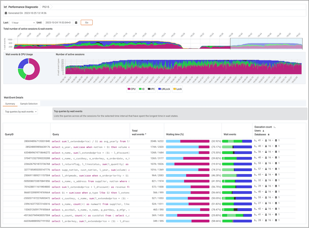
By default, the top Performance Diagnostic graph pulls the data of the last hour, starting from the current date and time. This graph shows the time series containing the number of active sessions. Each point of this time series represents the sum of wait events and CPU usage over the previous 15 seconds. These sessions might be waiting for a wait event or using the CPU at a particular point in time. This time series is generated based on the wait event samples collected by the EDB Wait States extension.
To open the Performance Diagnostic dashboard in a new browser tab, select Preferences > Open in New Browser Tab?.
Performance Diagnostic dashboard
The first graph displays the number of active sessions and wait event types for the selected duration. You can change the duration in the first graph to analyze the data for a specific time period.
By default, the duration selection in the first graph is 15 minutes. The duration can be extended up to one hour. To see the duration on a graph, select a duration from the Last list. To display the data for a specified date and time, select a date and time from the Until list.
The next section plots the following graphs based on the selected duration in the first graph:
- Donut graph — Shows total wait event types and CPU usage according to the duration selection in the first graph. This graph can provide a better understanding of how much time those sessions spent waiting for an event.
- Line graph — Plots a time series with each point representing the active sessions for each sample time.
To differentiate each wait event type and the CPU usage more clearly, the graph for each wait event type displays in a different color.
Select a time on the line graph to analyze the wait events. To show or hide a wait event type in all the graphs, select the graph legends. The analysis is simpler when you can see only the wait event types you want to analyze.
The third section displays the wait event details in the Performance Diagnostic dashboard based on your selected duration in the second graph. It displays the wait event details on two tabs:
The Summary tab displays the list of top 15 SQL queries with query IDs, total CPU events, percentage of CPU usage, wait events, and execution count for the selected time interval. These SQL queries are grouped into four categories:
Top queries by wait events — Lists the queries across all the sessions for the selected sample time that have spent the longest time in wait states. It displays the query ID, query, total wait events, waiting time in percentage, wait events, and the execution count along with number of users that executed that query in the number of databases.
Top queries by CPU usage — Lists the queries across all the sessions for the selected sample time that used the most CPU time. It displays the query ID, query, total CPU events, CPU usage percentage, wait events, and execution count along with the number of users that executed that query in the number of databases. The data in the table is in decreasing order of the number of CPU events.
Top users by wait events — Lists the users across all the sessions for the selected sample time whose queries have spent the longest time in wait states. It displays the usernames, database name, total wait events, waiting time percentage, wait events, and the number of queries that have spent the longest time in wait states.
Top users by CPU usage — Lists the users across all the sessions for the selected sample time whose queries used the most CPU time. It displays the username, database name, total CPU events, CPU usage percentage, wait events, and the number of queries that used the most CPU time.
The Sample Selection tab displays the details of the wait events for the selected sample time in the second graph. The wait events are grouped by:
Queries — Lists the queries along with query IDs and number of sessions that executed the query in the selected sample time.
Select the eye in any row to display a window with details about that query. For more information, see Query information.
Users — Lists the details of the wait events grouped by users that executed the queries along with the number of events and execution count of the query.
Waits — Lists the number of wait events belonging to each wait event type for the selected sample time.
You can filter the data displayed in the rows under both the tabs. You can also sort the data alphabetically by selecting the column headers.
Query information
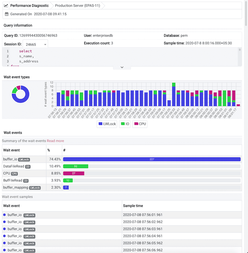
To open the query information window, select the eye in any row of the Queries grouping under the Sample Selection tab. This window displays in the Query information section a query ID and its corresponding session IDs in a list at that selected sample time. You can select the Session ID list for the selected query whose data you want to analyze. The details corresponding to the selected session ID and query ID appear. The Query information table also displays the SQL query.
The Wait event types section displays the total number of wait event types for the selected session ID and query ID. It shows two types of graphs:
Donut graph — Shows the proportions of categorical data.
Timeline bar graph — Visualizes trends in counts of wait event types over time.
To differentiate, each wait event type is represented by a different color in the bar graph.

The Wait events section has a table displaying all the wait events that occurred during the query execution. It displays data in decreasing order by number of wait events. The second table displays the wait event with sample times that occurred over the period of the whole query execution. It allows you to analyze the wait events during the query execution over the period of time. Also, it shows the actual samples collected by the EDB Wait States extension for that query ID and session ID.